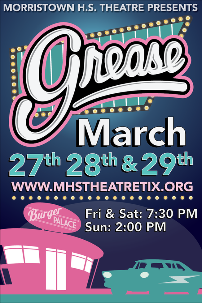
Grease
The 2015 Spring Musical, Grease! We decided to color the poster pink, for the pink ladies and a traditional diner teal. We wanted most of the poster to be filled
with information so we put most of our design focus on the logo and our "diner sign". We also added traditional 50's styling to the bottom of the page, including the
iconic Burger Palace (after the Burger Palace Boys) and their pride and joy, Greased Lightning!
with information so we put most of our design focus on the logo and our "diner sign". We also added traditional 50's styling to the bottom of the page, including the
iconic Burger Palace (after the Burger Palace Boys) and their pride and joy, Greased Lightning!
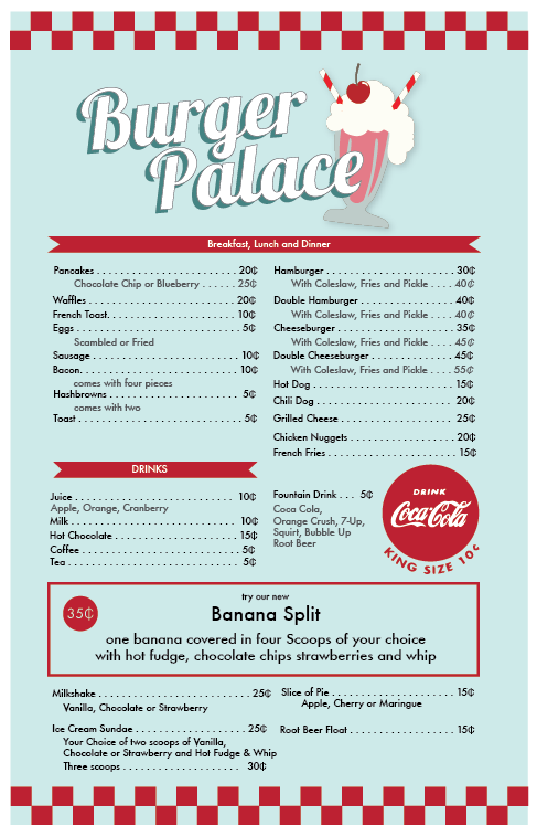
Additional Grease Memorabilia
In addition to the promotional material, I made props for the show and around the theatre. We mad a walk-in Burger Palace, which we made to look like a classier 50s style diner. I also researched 50s style design and made various posters accordingly to hang up around Rydell. The posters follow the 50's idea of simple shapes and lines, and use period-appropriate fonts and typography styles (including the not so perfect drop stamps)
|
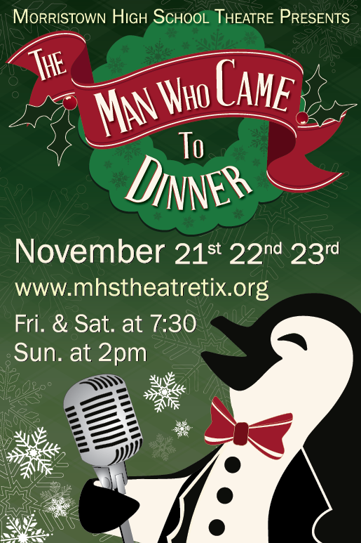
The Man Who Came To Dinner
The 2014 Fall Drama, The Man Who Came To Dinner.
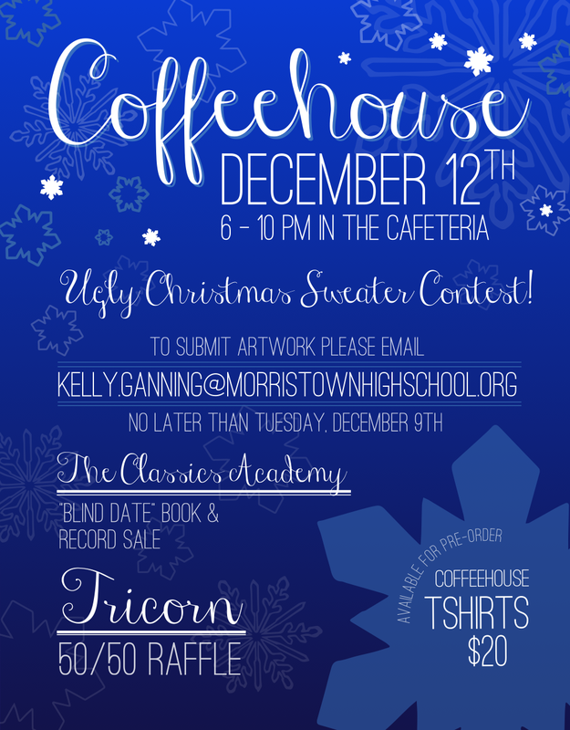
Coffeehouse Poster
Coffeehouse is our bi-monthly open mic event, with different activities every month.
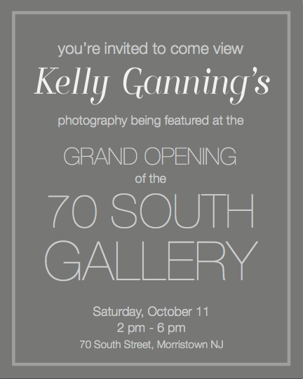
Invitations